
Fluid
Responsive type and spacing that adapts

About Fluid
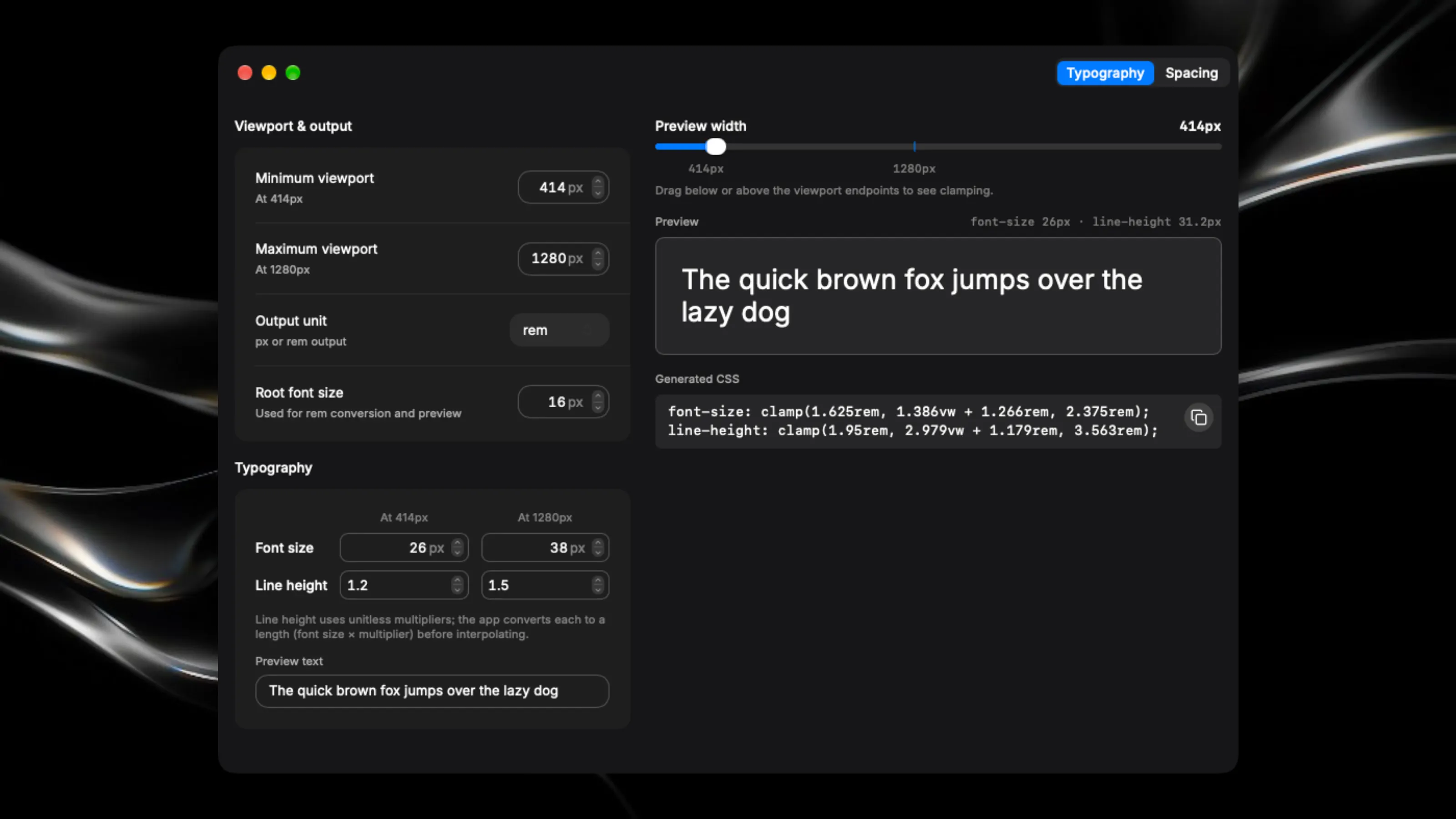
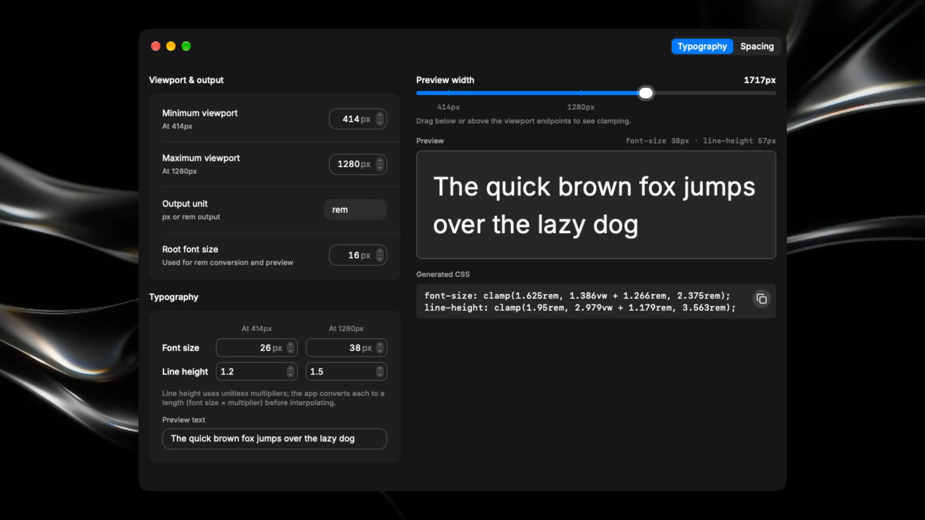
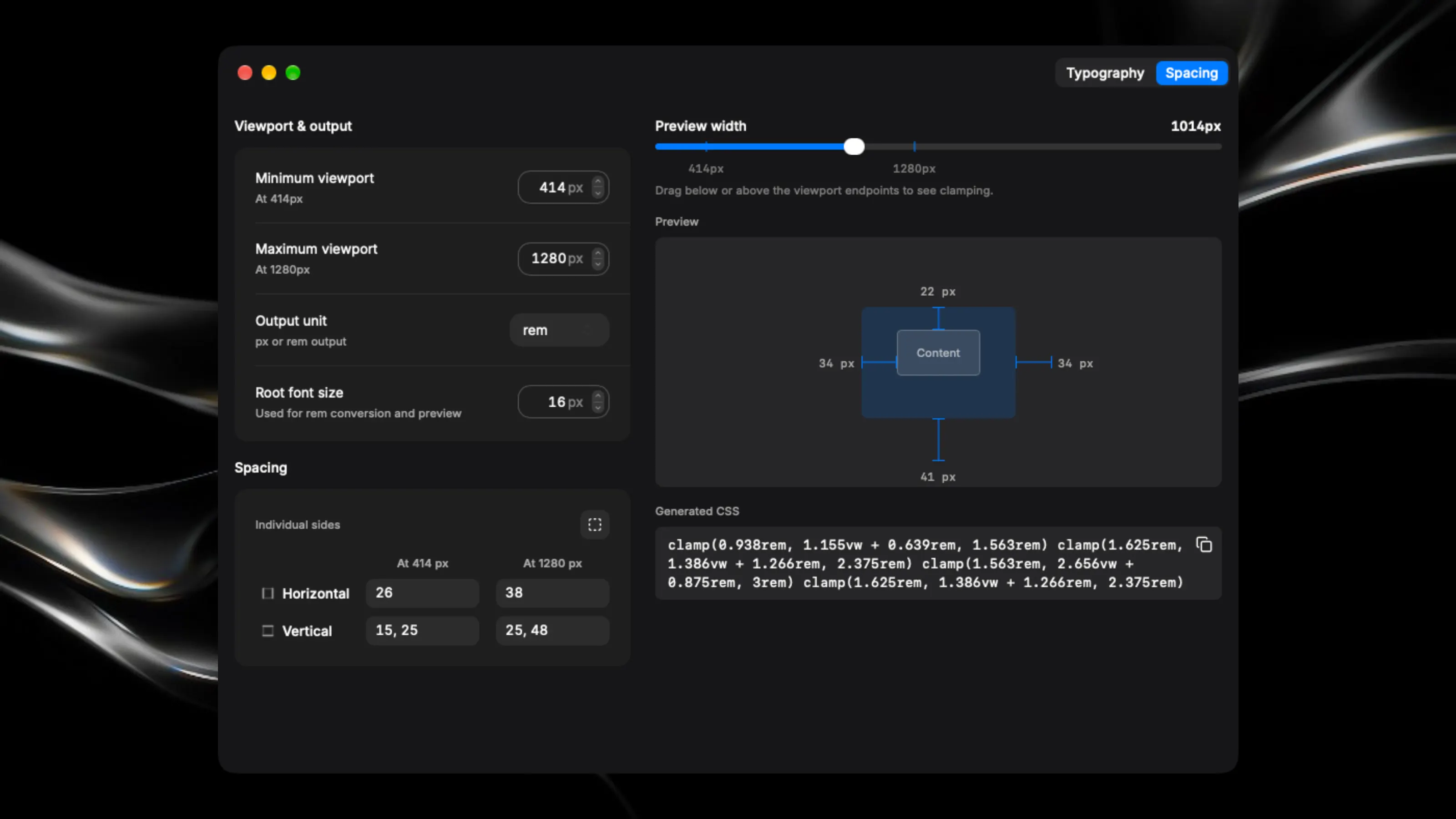
Create responsive typography and spacing without doing the maths by hand. Set your viewport range, enter your starting and ending values, and copy fluid CSS straight into your project. Fine-tune font sizes and line heights in Typography mode. Switch to Spacing mode to generate reusable values for padding or margins, with independent sides, linked pairs or one value for all sides. - Preview how values change across viewport widths. - Choose pixel or rem output. - Inspect spacing with a visual diagram and live measurements. - Copy ready-to-use CSS with a click. - Pick up where you left off with automatically saved settings. A focused desktop tool for designers and developers working with responsive layouts.