
Helix
Scientific data analysis, simplified

About Helix
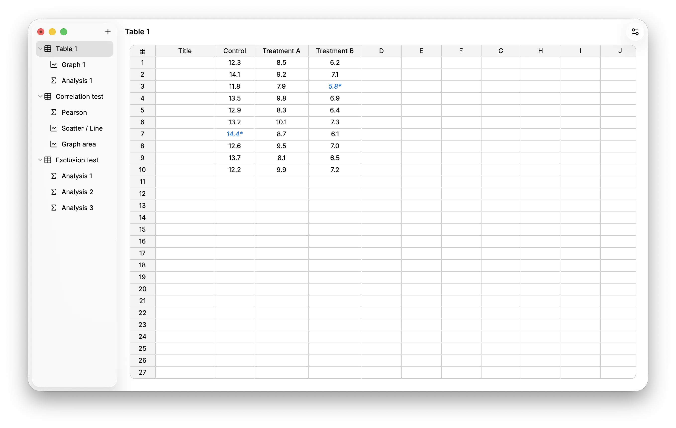
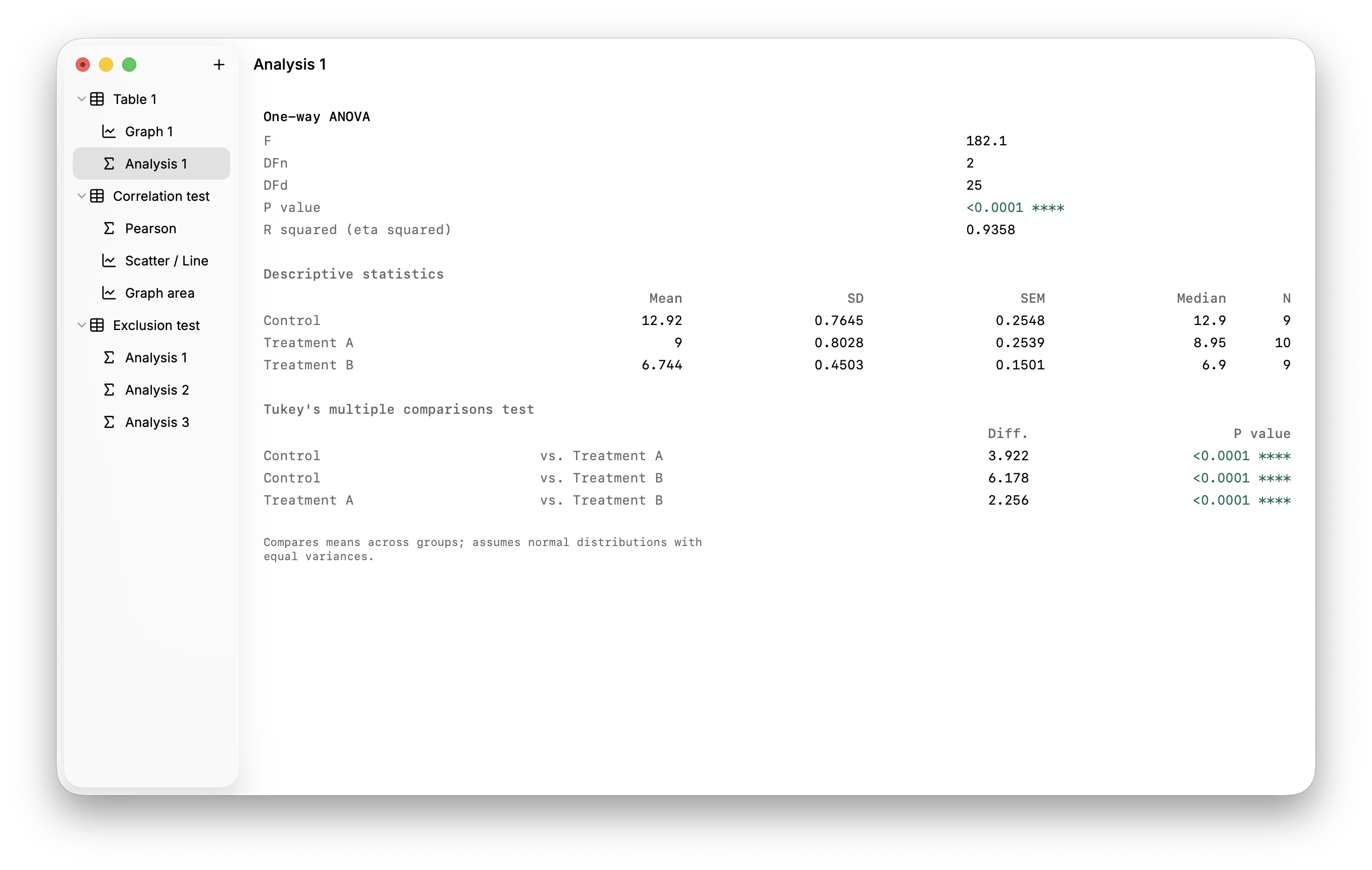
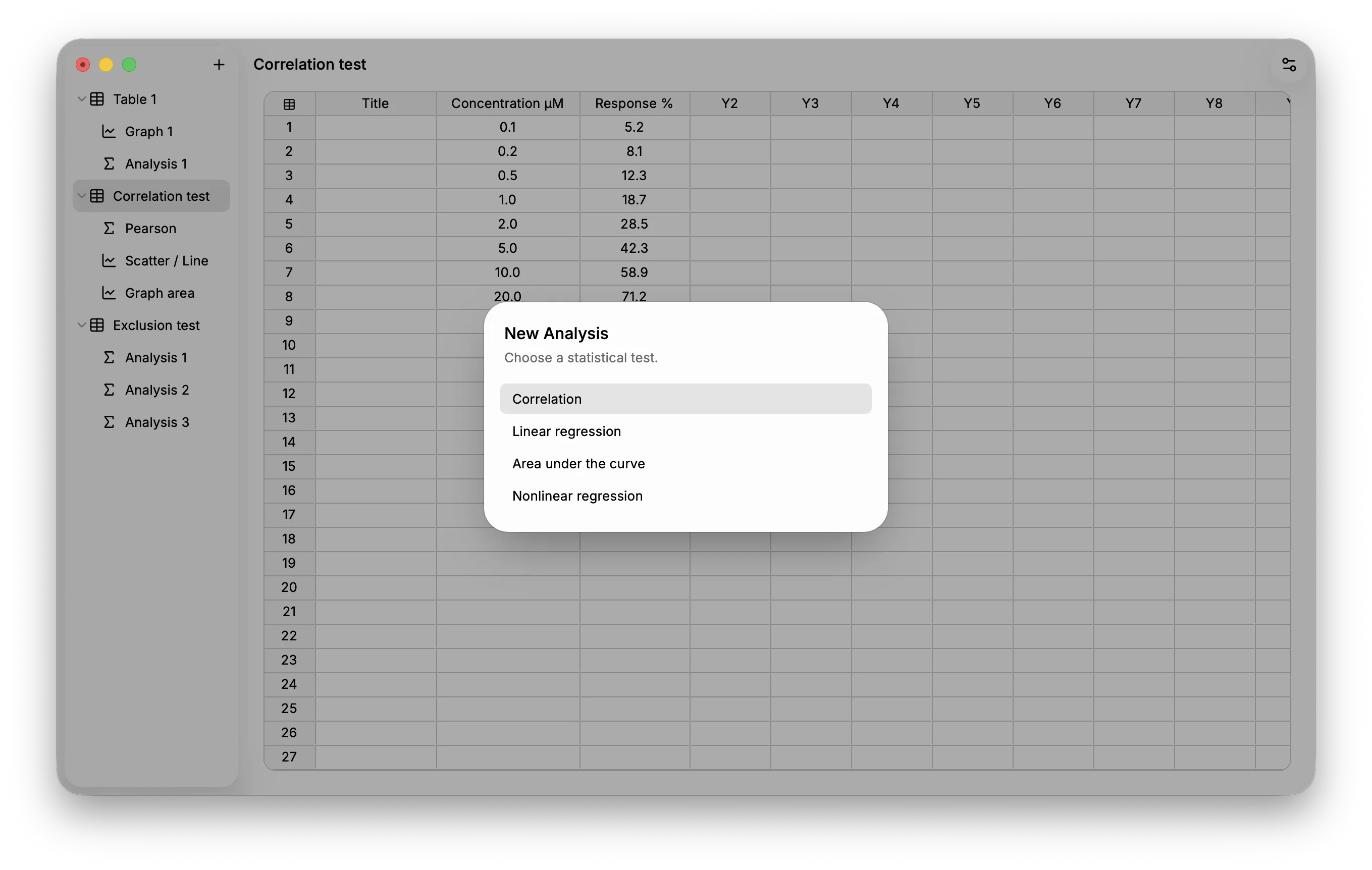
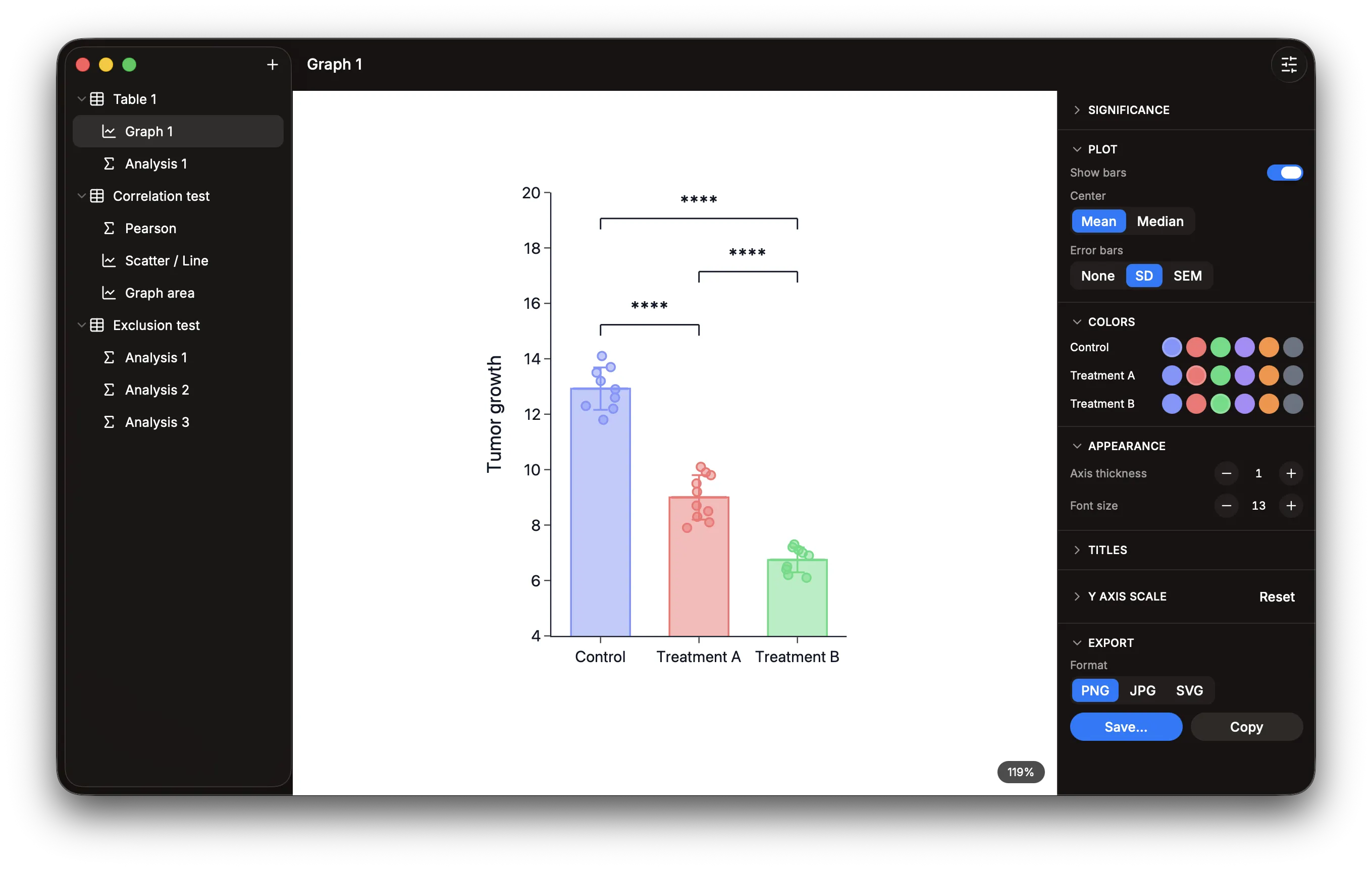
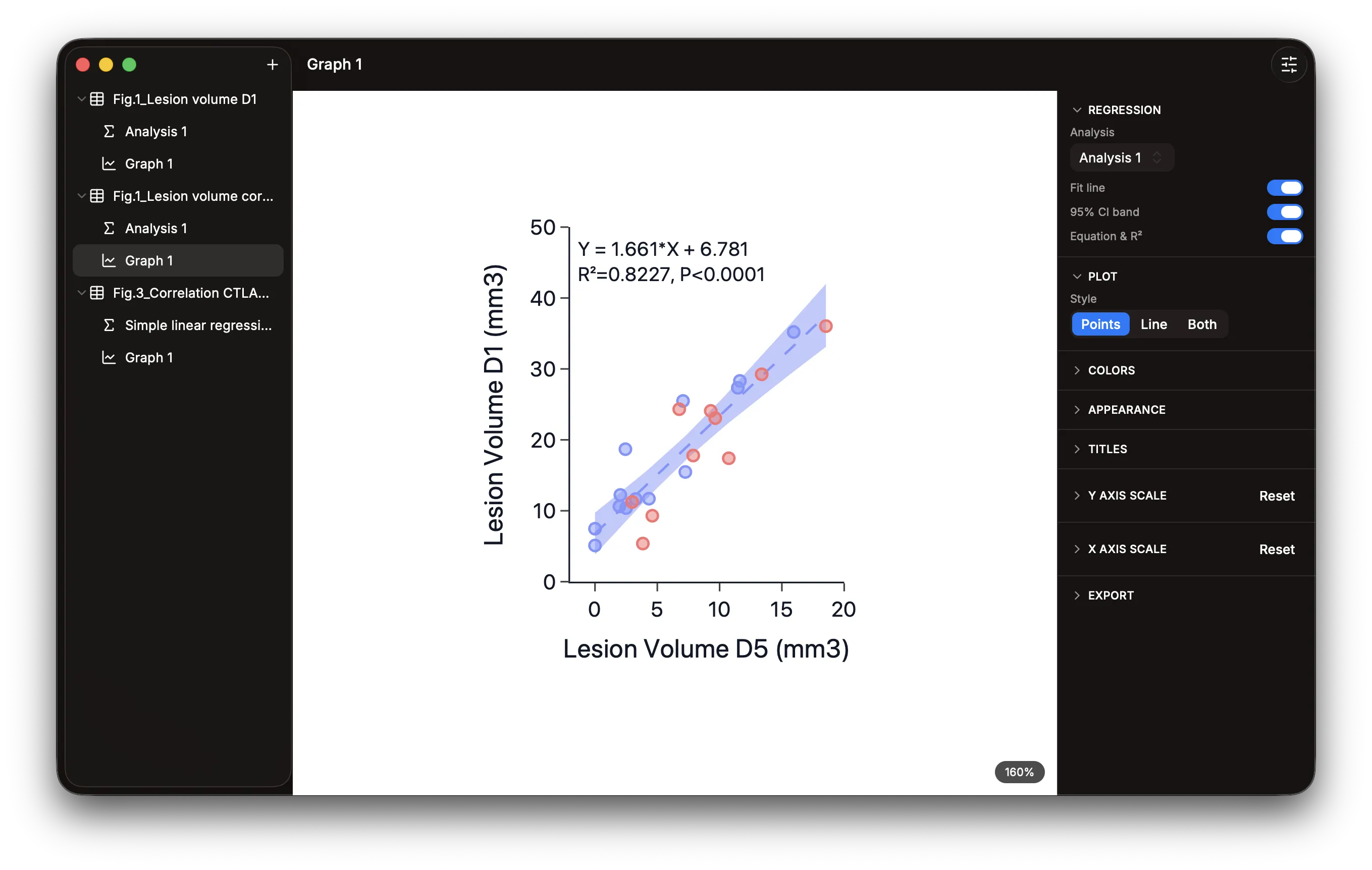
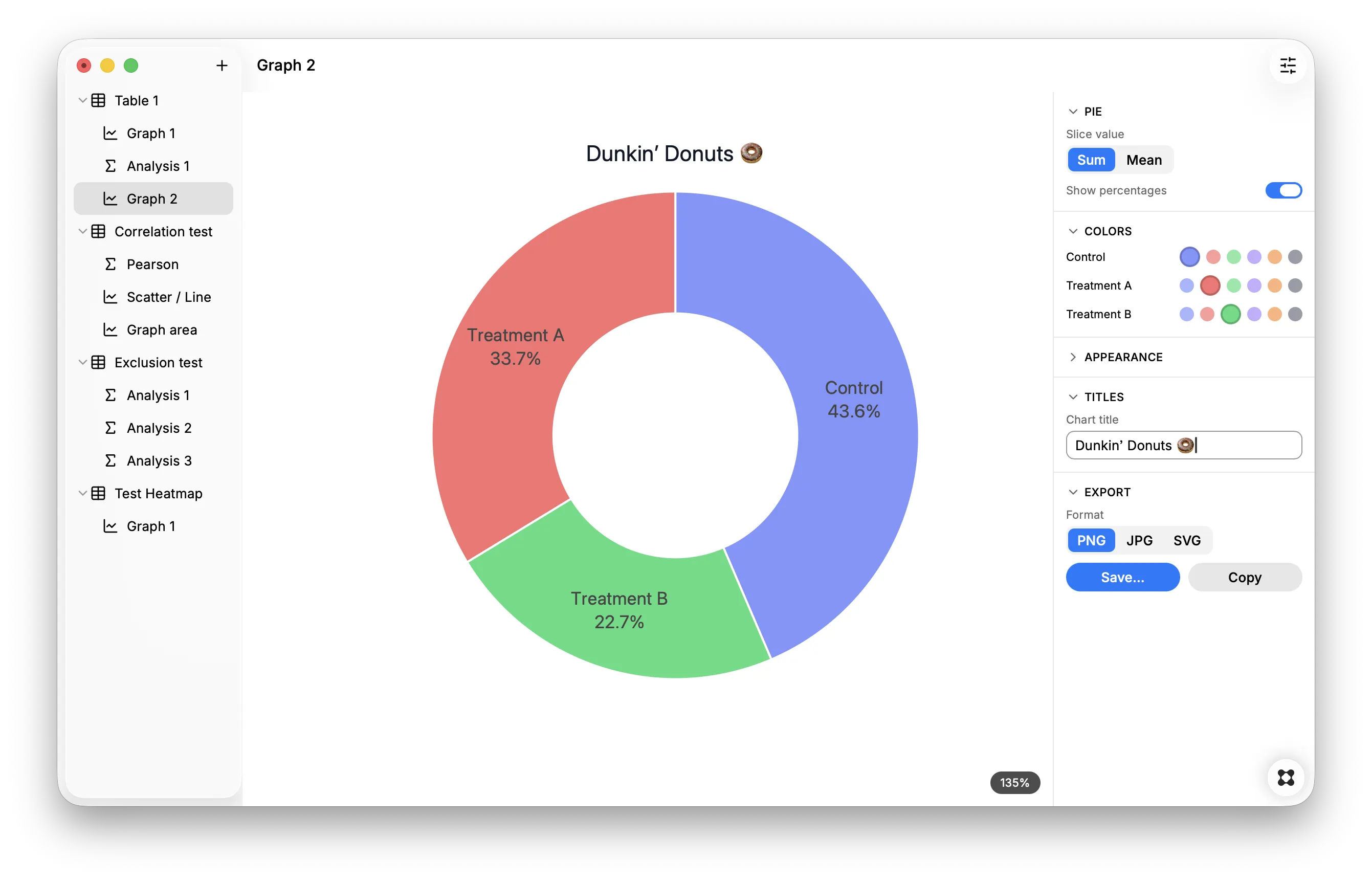
Helix helps you organize, analyze, and visualize scientific data from raw numbers to publication-ready charts — powered by three trusted open-source engines: Jspreadsheet CE for tables, WebR (R running in WebAssembly) for statistics, and Plotly for graphs. Think of it as a free, minimalist alternative to GraphPad Prism. Note: this is a foundation in active development. Feedback, bug reports, and feature requests are welcome. **Data Organization** - Three-pillar structure — Tables → Analyses / Graphs, with every analysis and graph linked back to its source table - 5 table types — Column, XY, Grouped, Multiple Variables, Contingency — each offering the analyses and graphs that fit its data shape - Spreadsheet-style grid — Copy/paste, undo/redo, multi-cell selection, row/column deletion - Data exclusion — selectively exclude data points from graphs and statistical analyses **Statistical Analyses** Smart guided wizards propose the right test for your table type: - Column tables — descriptive statistics; compare two groups (Student's t, Welch's t, Mann-Whitney, paired t, Wilcoxon); compare multiple groups (one-way ANOVA, Kruskal-Wallis, repeated-measures ANOVA, Friedman); one-sample t test; identify outliers (ROUT method, Motulsky & Brown, with adjustable false-discovery-rate Q) - XY tables — correlation, linear regression, nonlinear regression (straight line, sigmoidal 4PL, semilog, hyperbola, polynomials), area under the curve - Grouped tables — two-way ANOVA, multiple t tests - Multiple Variables tables — correlation matrix, multiple regression - Across all tests — post-hoc comparisons (Tukey, Bonferroni, Dunn's) and multiple-comparison corrections (Holm, FDR / Benjamini-Hochberg) **Graphs** Each table type offers the chart types that suit its data: - Column tables — individual values, box & violin plots, mean ± error bars, pie and donut charts - XY tables — scatter, bar, and area plots; dose-response curves (one-click sigmoidal 4PL with EC50 and Hill slope on the graph); Kaplan-Meier survival curves (censored-subject ticks, from event codes or survivor counts) - Grouped tables — grouped scatter, bars, lines, stacked bars, horizontal bars - Multiple Variables tables — heatmaps with selectable color scales (Viridis / Red-Blue / Heat), optional value labels and a legend Shared across every graph: - Custom colors — assign a color to each data series, or highlight individual data points; colors are shared by every graph drawn from the same table - Regression overlay — draw a linked linear-regression fit line, 95% confidence band, and equation with R² directly on scatter plots - Interactive rendering — zoom in and out, adjust axes thickness and font size - Resizable graphs — drag any axis to resize, with a live size readout to match dimensions across graphs - Axis control — manual or automatic min/max/step - Error bars — SD, SEM, or none - Significance annotations — stars or p-values with pairwise comparisons - Export to PNG, JPG, or SVG; copy to clipboard **Projects & Interface** - Native `.hlx` project format (JSON-based, fully portable) — open and edit with any text editor - Native menu bar with keyboard shortcuts - Decimal separator conversion — automatically convert commas to periods in all spreadsheet numbers (required for R compatibility) - Light, dark, or automatic theme